
Glitter vs holographic acrylic: what buyers are really comparing
When people ask about glitter vs holographic acrylic, they are usually not comparing chemistry in a lab sense. They are trying to decide which decorative finish will look better on a retail product, whether that product is a collectible card, a display plaque, or an anime-style desk piece. The finish changes how the artwork reads under shop lighting, how premium the item feels in hand, and even how forgiving the print is if the image has dark areas or fine line work.
That matters more than it sounds. A flashy surface can sell a product fast, but the wrong effect can fight with the illustration. On a character piece, especially something in the style of an anime merchandise finish, the surface treatment should support the art, not drown it out.
Quick comparison at a glance
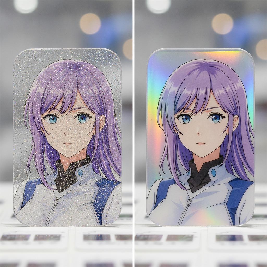
Glitter acrylic uses embedded sparkles or a sparkle-like visual layer that gives the surface a scattered, festive shimmer. Holographic acrylic, by contrast, throws shifting rainbow reflections across the piece when light moves. One feels textured and playful; the other feels sharper and more optical.
For a glitter acrylic card, the appeal is usually warm, decorative, and easy to read from a distance. For a holographic acrylic card, the appeal is movement. It catches light aggressively, which can be excellent for a retail display but slightly risky if the design already has strong colors, metallic tones, or a lot of small detail.
That distinction is important for buyers who are choosing between decorative acrylic effects for a fandom product, a souvenir, or a seasonal retail item.
How each finish behaves on a printed character piece
The visible sample here appears to be a clear acrylic or similar plastic panel with full-color character artwork, a rounded-rectangle shape, and a glossy surface layered over a printed insert or direct print. That sort of format is common in anime merchandise finishes because it gives the illustration a clean edge and a collectable feel.
Glitter acrylic tends to soften the visual contrast a little. The sparkle can make the piece feel celebratory and giftable, which works well for character art, special editions, and seasonal packaging. It is often the safer choice when the illustration already uses rich costume detail, such as gold trim, dark jackets, red accents, or floral backgrounds. The glitter adds atmosphere without necessarily overpowering the line work.
Holographic acrylic is more assertive. Its prism-like reflection can create a premium, high-energy look, especially on sharper compositions or simpler art. But if the artwork already has gold accents, reflective elements, or a busy background, the holographic pattern may compete with the image. That is not always a dealbreaker; it is just something a sourcing manager should notice before committing to a production run.
Which finish suits which product?
Choose glitter acrylic when:
The product is gift-oriented.
The artwork includes warm, ornate, or seasonal design cues.
You want a softer decorative read in retail packaging.
The target buyer values charm over visual flash.
Choose holographic acrylic when:
You want stronger shelf impact.
The artwork is simpler and can tolerate a more active surface.
The product is aimed at collectors who want a noticeable shine effect.
You need the finish to stand apart in a crowded display case.
Why the same illustration can look very different
This is where buyers sometimes misjudge the outcome. The same printed art can appear elegant on one substrate and noisy on another. Dark uniforms, fine facial features, and small decorative borders are especially sensitive. A glitter layer can add depth, while a holographic layer may shift attention toward the surface rather than the character.
That does not mean holographic is always too strong. It can work very well on limited-edition releases, especially if the design uses clean blocks of color and bold outlines. But for portrait-format pieces with ornate costumes and packaging art, many product teams lean toward a finish that supports readability first.
Material and manufacturing notes buyers should ask about
The product description here suggests a printed acrylic sheet with a glossy finish, possibly made by UV printing, reverse printing, or lamination. That is plausible for this category, but it should be confirmed with the supplier before ordering. Do not assume the same base material simply because two items both look “shiny.”
A buyer should ask whether the glitter or holographic effect is part of the acrylic sheet itself, a laminated film, or a printed visual effect. Those choices affect appearance, scratch behavior, and consistency across a batch. Packaging also matters. A decorative acrylic card in a printed paperboard backing can look more premium than the same panel in plain wrap, especially if gold-toned graphics or branded inserts are involved.
Common mistakes in sourcing these finishes
The biggest mistake is approving a sample under one light source and expecting the same effect everywhere. Glitter and holographic surfaces change a lot under retail LEDs, daylight, and phone flash. Another common miss is pairing a very busy finish with very detailed art, then discovering the character is harder to see than the marketing team expected.
A smaller but real problem: buyers sometimes focus on the front face and forget the edge quality, the printed backing, or the protective sleeve. For desktop collectibles and gift items, those details shape perceived value almost as much as the artwork itself.
Practical buyer advice
If the priority is broad appeal and easy viewing, glitter usually feels safer. If the priority is shelf drama and collector buzz, holographic often wins. The right answer depends less on trend and more on the role the product plays in the assortment.
For anime merchandise, that can mean choosing one finish for mainline retail and another for special editions. It is not unusual to reserve holographic effects for a smaller run and use glitter on larger giftable inventory. That split keeps the catalog from looking repetitive and gives buyers more control over price tiering, even when the base format stays similar.
If you are sourcing this kind of display item, request samples under real store lighting and view them at arm’s length. That simple check often reveals more than a spec sheet.
FAQ: glitter vs holographic acrylic
Is holographic always more premium?
Not necessarily. It is more visually active, but premium depends on how well the effect fits the artwork and packaging.
Does glitter hide print detail?
It can, if the sparkle is heavy or the artwork is already busy. On simpler designs, it may add depth without reducing clarity.
Which is better for anime merchandise?
Neither is universally better. Glitter works well for softer, decorative presentation. Holographic suits high-impact collector pieces.
Next step for buyers
If you are choosing between glitter acrylic and holographic acrylic for a character display, ask for samples, confirm the print method, and check how the artwork reads in retail lighting. That is the practical way to avoid a finish that looks exciting in photos but awkward on the shelf. For sourcing teams, the decision is rarely about which effect is more popular. It is about which one makes the product easier to sell, easier to present, and less likely to disappoint when the carton is opened."}