
What buyers are really trying to solve with glitter acrylic card manufacturing
When people look into glitter acrylic card manufacturing, they are usually not shopping for a single process. They are trying to solve a merchandising problem: how to make a small display item feel premium, durable, and worth keeping. That matters whether the card is sold as anime merchandise, a fan gift, a retail souvenir, or a limited-run desk display. A flat printed card can look fine in a mockup, but once it is handled, photographed under shop lighting, or placed next to other collectibles, the finish and construction decide whether it feels special or forgettable.
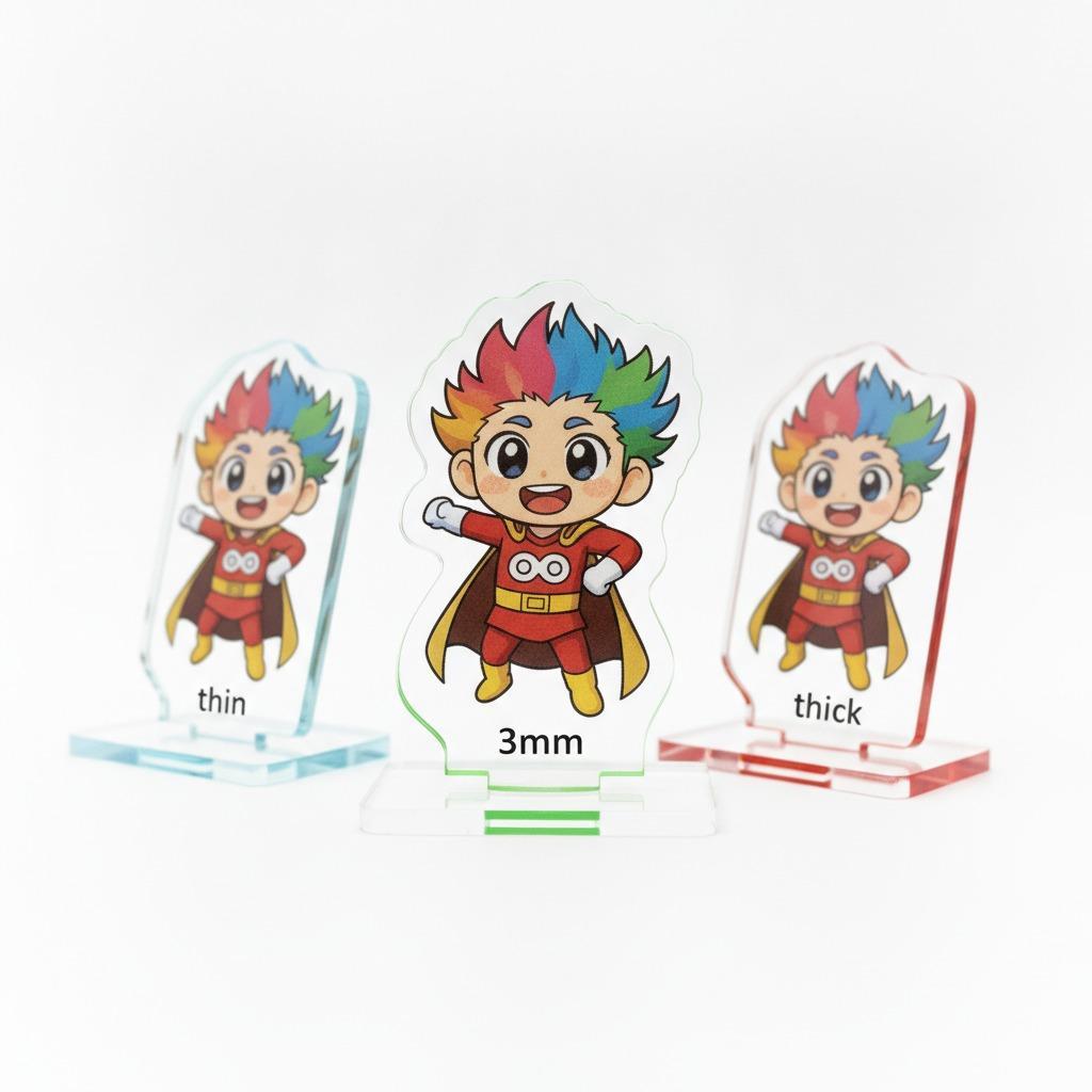
The product type in question often has a rectangular portrait format, rounded corners, and a glossy front with layered artwork beneath or behind a clear surface. That layered look is important. It gives the piece depth, and depth is what buyers notice first when the item is meant to sit on a desk or in a display case. The challenge for sourcing teams is choosing a production method that supports that look without creating unnecessary scrap, color shift, or assembly trouble.
What the construction typically involves
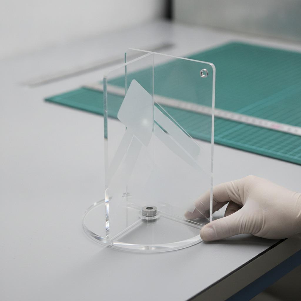
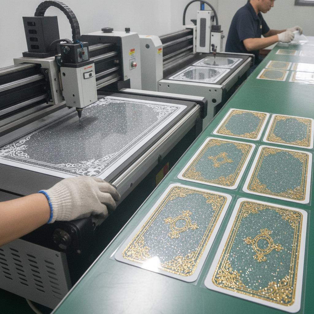
Based on the kind of collectible piece described, the build is usually some mix of color printing, cutting, and lamination or encasing. In some cases the front layer may be actual acrylic; in others it may be a clear plastic cover or a resin-coated surface that creates a similar visual effect. The exact material should be confirmed with the supplier rather than assumed, because the word “acrylic” gets used loosely in the gift and fan-merchandise market.
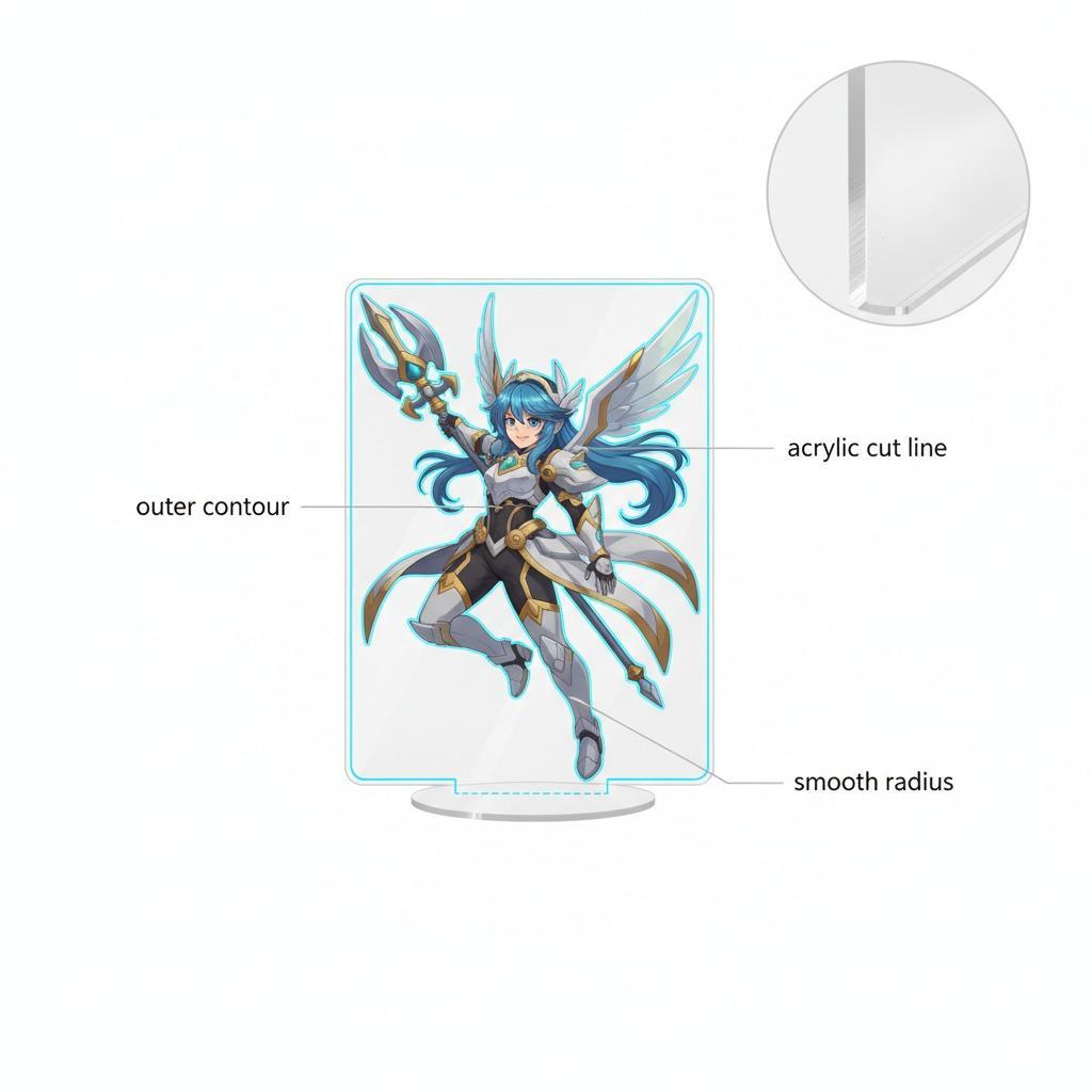
For buyers, the key point is not just what the item is made from, but how the layers interact. If the decorative backing card, printed insert, and clear front layer are not aligned well, the piece can look cheap even when the artwork is strong. Edges, corner radius, and gloss consistency matter more than many new buyers expect.
Quick comparison: the main production routes
1. Printed insert with clear protective front
This is common for display-style merchandise. Artwork is printed on paperboard or a film insert, then paired with a clear front layer. The result can be visually rich at modest cost, but it depends on careful cutting and registration.
2. UV printing acrylic cards
UV printing acrylic cards can be a practical choice when the artwork needs to sit directly on a rigid transparent substrate. The method is useful for crisp graphics and layered effects, but white ink coverage has to be handled carefully. Poor white underprinting can make colors look thin or washed out on clear material.
3. Glitter acrylic printing with decorative effects
Glitter acrylic printing is often chosen when the brief calls for sparkle, flash, or collectible shelf appeal. The tradeoff is predictability. Glitter effects can look dramatic in a sample and slightly different in production if the layer thickness, print order, or surface finish changes. That is not a flaw in the method so much as a reminder to lock down samples before committing to volume.
How to judge whether the process fits the product
Start with the intended use. A retail souvenir that will be handled frequently needs different construction priorities than a limited-edition fan item that spends most of its life on display. If the card must survive repeated carrying in a bag, edge protection and scratch resistance deserve more attention. If the main goal is visual impact on a shelf, glossy finish and artwork depth may matter more than everything else.
Next, check how the illustration is built. The product described features an anime-style character portrait with gold-toned decorative elements and an ornate border. That kind of artwork benefits from a production method that preserves fine line detail and stable color blocking. If metallic accents are part of the design, ask how they are simulated. Not every shiny effect is actual foil, and not every gold look will read the same under retail lighting.
Common mistakes buyers make
The first mistake is treating all clear-front merch as the same. A glossy surface is not a process specification. Ask what the front layer actually is, how it is attached, and whether the print is protected or exposed.
The second mistake is ignoring white ink printing, especially on clear or translucent constructions. Without a proper white layer, characters and background elements can lose contrast fast. This is easy to miss in digital proofs and painfully obvious in hand samples.
The third mistake is approving artwork before checking the cut path. Rounded corners, border placement, and print bleed all affect the final look. A design that looks balanced on screen can feel crowded once it is trimmed.
Practical buyer guidance before you order
Ask the supplier for a sample that matches the intended structure, not just the artwork. Confirm the material stack, gloss level, and whether the piece is intended to stand alone or be used with a backing package. If the product will be sold as collectible merchandise, packaging presentation may matter nearly as much as the card itself.
It is also worth checking how the product is described internally. If one team calls it an acrylic card and another team calls it a printed display piece, you can end up with mismatched expectations on cost, finish, and shipping risk. That sounds basic, but it causes more delays than people admit.
Step-by-step way to move from concept to production
1. Define the use case: display item, gift product, fan merchandise, or retail souvenir.
2. Decide the visual priority: clarity, sparkle, thickness, gloss, or layered depth.
3. Confirm the material route: actual acrylic, printed plastic, laminated insert, or another build.
4. Review print method options, including UV printing acrylic cards where appropriate.
5. Check whether white ink printing is needed for opacity and image strength.
6. Approve a physical sample and inspect edges, alignment, and surface quality.
7. Lock the packaging format before production so the finished piece arrives as intended.
Why this matters for sourcing teams
For sourcing managers and product teams, glitter acrylic card manufacturing is less about novelty and more about repeatable presentation. The item has to look intentional, hold up in transit, and match the brand’s quality level without becoming difficult to make. That balance is where good supplier communication pays off.
If you are planning a new collectible line or a limited seasonal release, the next step is simple: define the visual effect you want, then ask the manufacturer to map the production route behind it. A clear sample is worth more than a polished description.