
What buyers are really looking for in custom rotating acrylic standees
When people search for custom rotating acrylic standees, they are usually not just hunting for a pretty desk ornament. They are trying to solve a display problem: how to make a small product feel animated, collectible, and worth a second look without moving into expensive mechanical packaging or bulky retail fixtures. That matters whether you are a merch buyer, a fandom brand, a gift seller, or a product team building a limited run promotion.
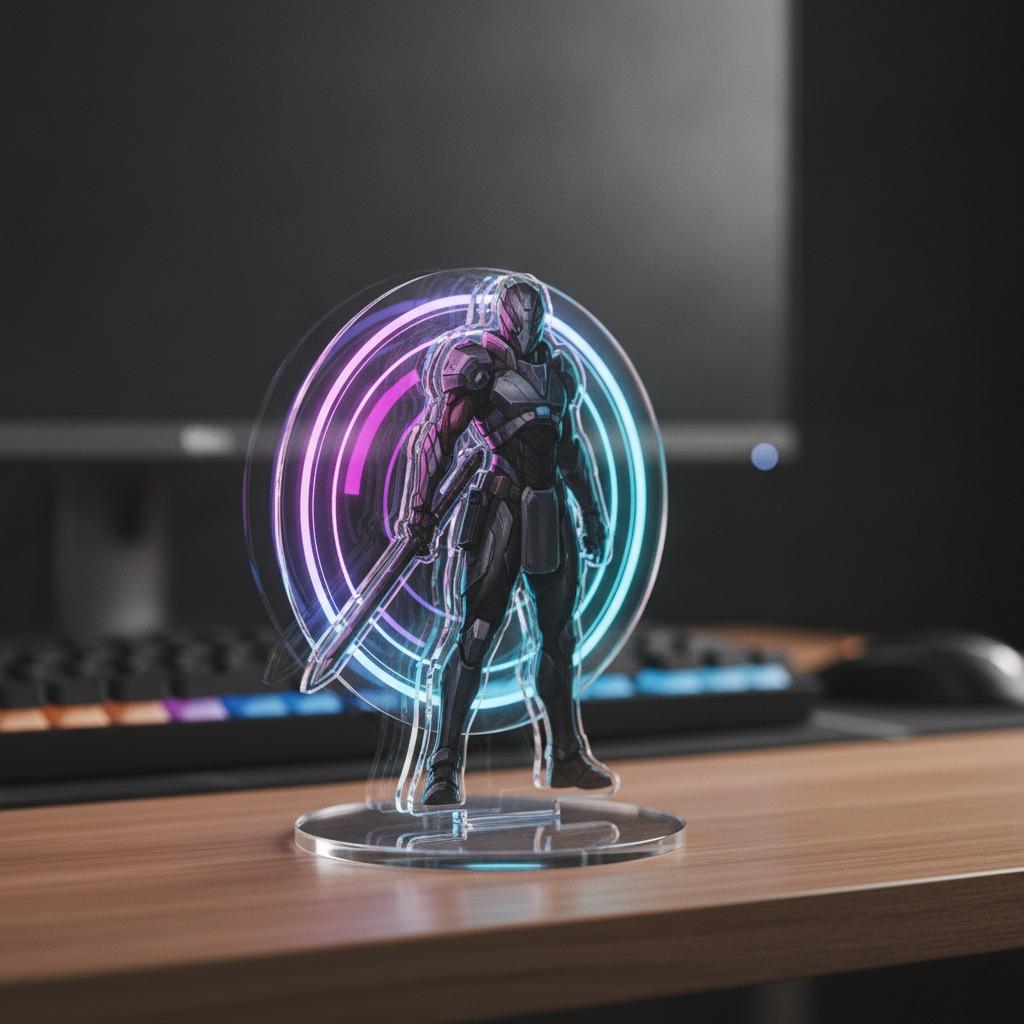
The appeal is easy to understand. A flat printed piece can sit quietly on a shelf. A moving or visually layered acrylic piece does more. It catches light, creates depth, and gives the eye a reason to linger. For buyers comparing an interactive acrylic display against standard tabletop signage, that extra moment of attention can be the difference between “nice” and “I need one of those.”
What this kind of product is, based on the sample details
The supplied product information points to a decorative acrylic tabletop display with a music theme. The design appears to combine a bright yellow-green rectangular panel with a large vinyl-record graphic on one side and two separate character cutouts on the other. The figures look like printed illustrations on transparent, die-cut acrylic. The overall effect is layered, glossy, and compact, the sort of object that works as desk decor, fandom merchandise, or a themed promotional gift.
One caution: the exact material and structure are not confirmed. It may be acrylic, or another clear plastic substrate with UV print and laser-cut edges. Likewise, the visible tab or arm-like detail does not make the item definitively rotating. Buyers should not assume a moving mechanism unless the supplier shows the actual assembly, hardware, and finished motion.
Why rotation or movement changes the buying decision
A movable acrylic standee is not just a novelty. It changes the display logic. Static character stands are good at showing artwork; moving pieces are better at creating engagement. In a shop counter, pop-up booth, or office desktop, motion draws more attention than a fixed silhouette. That can support impulse buying, social sharing, and repeat gift appeal.
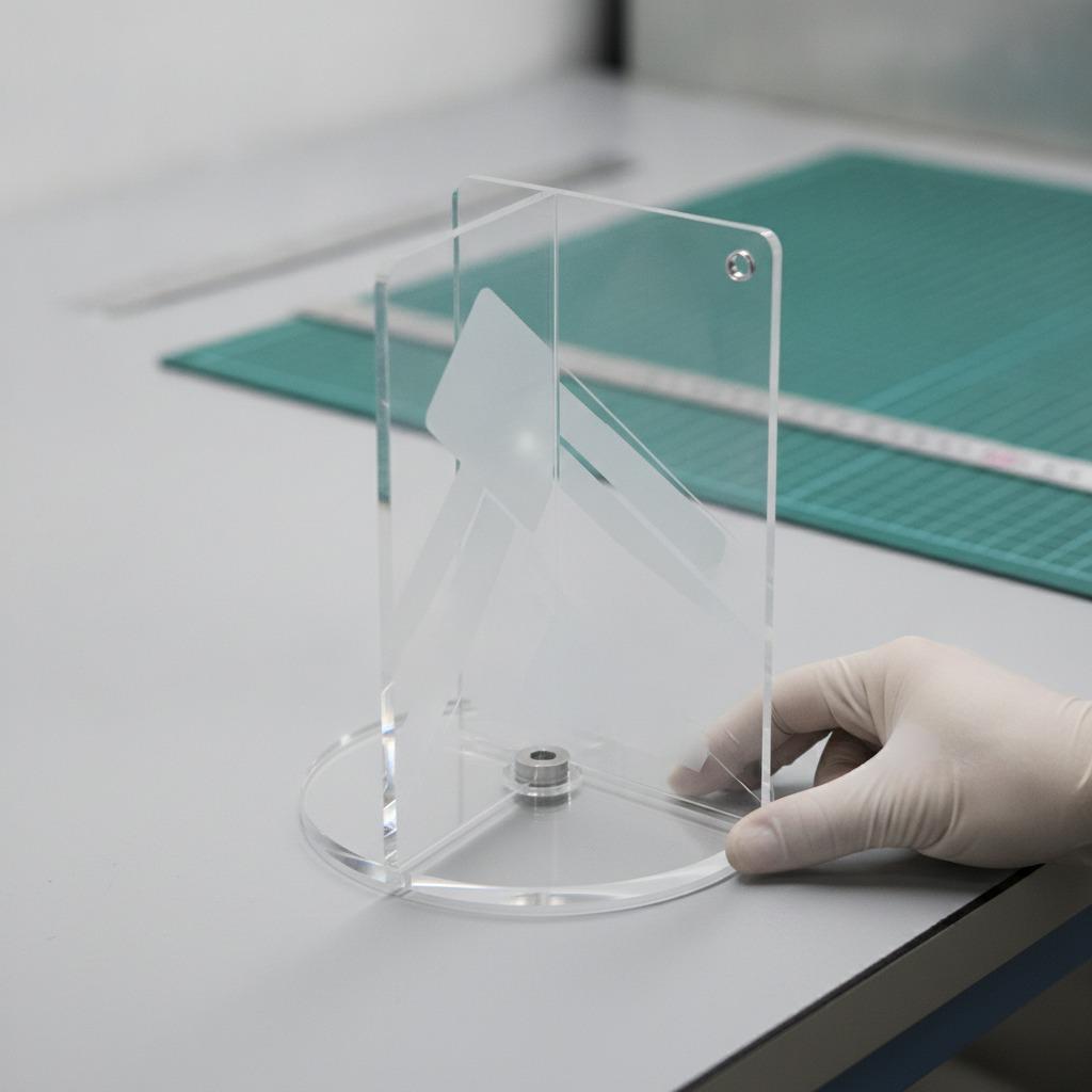
But movement also brings practical questions. Does the rotation feel smooth or flimsy? Will the mechanism survive shipping? Is the base stable on a narrow desk, or does the whole piece wobble when bumped? These are the boring questions that decide whether the final product feels premium or disposable.
Material and production choices that matter
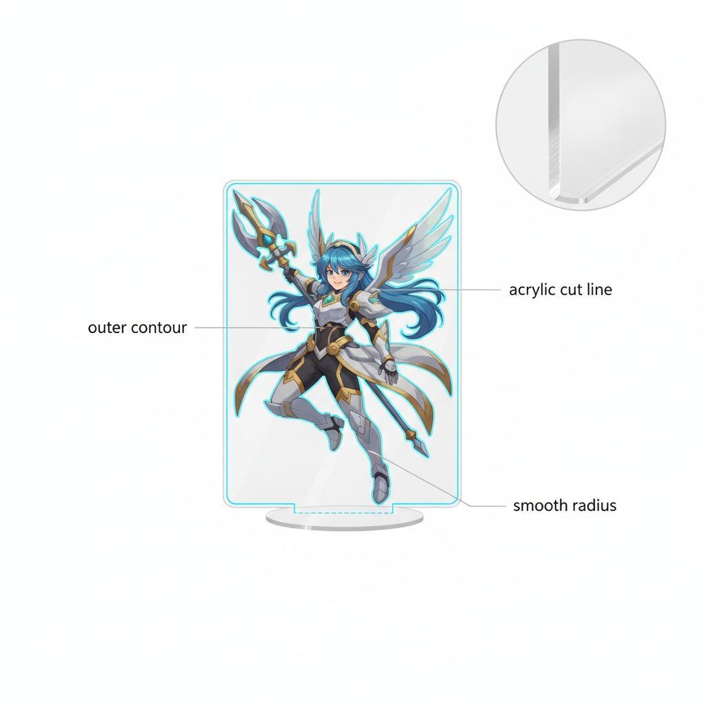
For an OEM acrylic display, the usual production path involves print, cutting, finishing, and assembly. UV printing is often used for vivid color on clear surfaces. Laser cutting or die cutting can produce clean character outlines and shaped panels. If the design includes layered graphics, the separation between parts becomes part of the visual appeal rather than a hidden detail.
In this type of product, clear edges and accurate registration matter more than many buyers expect. A small offset in print placement can make a character look off-balance. A rough cut edge can cheapen the whole piece. And if there is a mechanical component, alignment becomes even more sensitive. The safest buying habit is to ask for a pre-production sample or at least detailed photos of the actual finished item, not just the artwork file.
How to evaluate suppliers without overcomplicating it
If you are sourcing custom rotating acrylic standees, start with the basics:
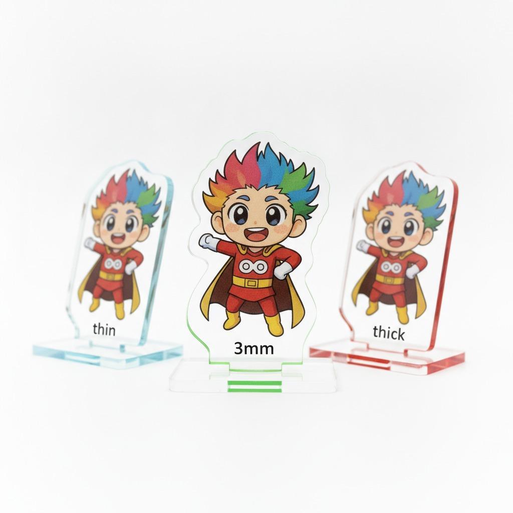
Ask what the product is actually made from, and whether the supplier is producing the print, the cut, and the assembly in-house or across multiple vendors. Clarify whether the item is static or genuinely rotating. Request the real thickness range if it affects stability. Confirm how the base or support system works, especially if the product is intended for desks, retail counters, or gift packaging.
For buyers in merch and promotional goods, artwork handling also matters. Transparent acrylic can be unforgiving with pale colors and thin outlines. Designs that look strong on a screen may disappear once printed on clear material unless the supplier understands opacity, layering, and contrast.
Common mistakes buyers make
The first mistake is treating every clear acrylic figure as the same thing. A rotating anime stand and a simple flat standee may look similar in a product photo, but they are not equal in cost, assembly complexity, or shipping risk.
The second mistake is approving artwork without checking how it interacts with transparency. Characters printed on clear acrylic need deliberate framing. Fine detail can vanish. Dark areas can overwhelm the composition. In the sample described here, the strong contrast between the neon-toned panel and the black record graphic helps the design hold together visually; that is not accidental.
The third mistake is assuming that a decorative piece can be handled like a rugged consumer product. These are display items. They should be packaged, stored, and shipped with that in mind. Scratches, dust, and edge chipping are the usual complaints, and they can undermine an otherwise solid design.
When this format makes the most sense
This style of product is a good fit when the goal is emotional appeal, fandom identity, or compact visual merchandising. It works for desk ornament lines, music-themed gifts, anime or character goods, souvenir counters, and limited-run retail promotions. It is less suitable when the buyer wants a purely functional sign or a heavy-duty display unit.
If you are planning a launch, think about the story the object tells. The sample’s record-player motif and character artwork suggest a narrative, not just a shape. That is often where acrylic merchandise performs best: it turns a small footprint into a scene.
Buyer checklist before placing an order
Before committing to a run, verify the artwork files, production method, and assembly details. Ask whether the mechanism is decorative or functional. Confirm what parts are clear, printed, or backed with color. Check how the item will be packed to prevent scuffs and breakage. If the seller mentions an interactive acrylic display, make sure the interaction is visible in a sample video or prototype photo, not just described in text.
And if the item is being localized for a market, check any text printed on the panel carefully. The Vietnamese phrase visible in the supplied image should be verified for meaning and context before using it in sales copy. That is a small step, but it saves awkward surprises later.
Practical next step for sourcing teams
If you are comparing suppliers, send the same artwork brief to each one and ask for a mockup, material recommendation, and assembly explanation. A good vendor will tell you where the design is strong, where it may need adjustment, and what parts of the build affect durability. That conversation usually reveals more than a polished catalog page ever will.
For this product category, the real decision is not whether acrylic can look attractive. It can. The real question is whether the finished display will feel intentional in the hand, on the shelf, and in the customer’s photo.