
Why acrylic cut line design matters in a real production case
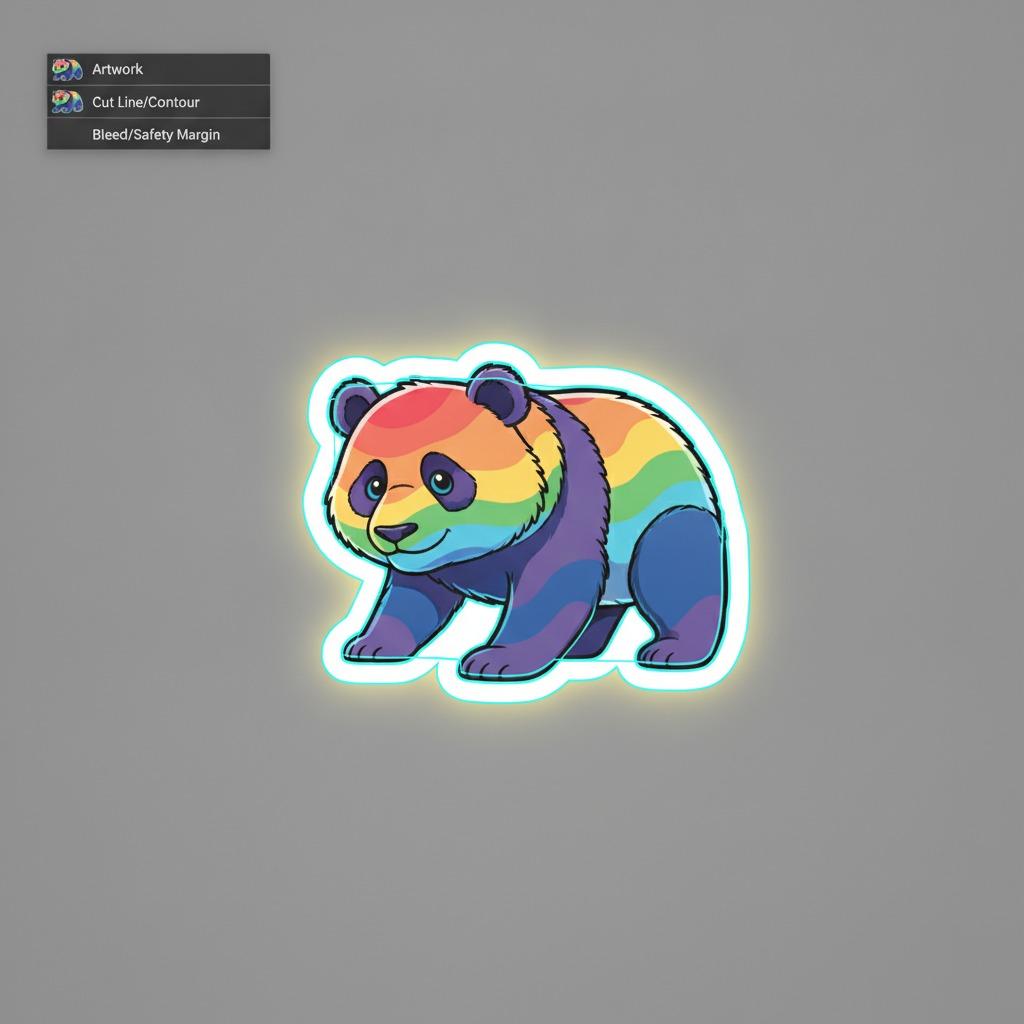
In decorative signage, the artwork usually gets the attention, but acrylic cut line design is what decides whether the finished piece looks deliberate or slightly off. That is easy to see in a character-based wall sign such as a panda-shaped display panel: the graphic depends on a clean silhouette, a generous border, and a contour that follows the illustration closely without nicking important details. When the cut line is wrong, the piece may still print fine, but it will not feel finished to a buyer standing in a nursery, playroom, or retail display.
This kind of project is a useful case study because it sits right at the intersection of print, finishing, and product design. The visual target is playful and simple on the surface, yet the production file has to account for white borders, irregular curves, and enough safety margin for the cutter to track cleanly. For sourcing managers and product teams, the real decision is not whether the art looks good on screen. It is whether the design can be manufactured consistently as a contour-cut panel with a neat edge and no awkward trimming surprises.
What the panda-style sign shows about the production approach
The visible product is a decorative cartoon-shaped wall sign or plaque with a panda character, a thick white border, and bright multicolor printed details. The shape is not a simple circle or rectangle. It is an irregular silhouette with oversized ears, arms, body, and a smaller integrated panda figure at the lower right. That tells you the cut file is doing a lot of work here.
In products like this, the artwork and the cut path have to cooperate. The print may include flowers in the ears, rainbow-like stripes in the mouth, and bold black outlines that help the character read at a distance. But if the contour cut is too tight, some of those visual cues can feel crowded. If it is too loose, the sign starts to look bloated and less precise. The white border is not just decoration; it acts as a visual buffer and gives the eye a clean edge between print and background.
Key file decisions behind a clean contour-cut result
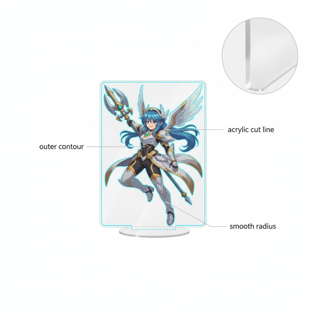
A good contour-cut job usually starts with the contour cutting file, which should be separated from the printed art and reviewed as its own manufacturing layer. That matters because the knife or router does not “understand” the illustration. It only follows the path it is given.
For decorative panels like this, the file should account for artwork bleed and the irregular geometry of the character. In practical terms, that means the printed image needs enough extra area beyond the final edge so slight movement, ink spread, or trimming variation does not expose a bad edge. The cut line itself should avoid pinches in narrow areas unless the substrate and finishing method are proven to handle them.
A few design choices matter more than they first appear:
Border width
The thick white outline makes the character feel separated from the background and also gives the cutter a little breathing room. For buyers, that border is often the difference between “cute” and “cheap-looking.”
Shape complexity
The more the design follows ears, paws, and small internal features, the more critical the acrylic design requirements become. Intricate edges demand careful handling, especially if the material is rigid and the finish is glossy.
Graphic placement
Text, facial features, and small motifs should not sit too close to the cut line. Even on a playful product, the margin discipline needs to be there.
Material and finishing considerations buyers should ask about
The image suggests a printed, die-cut panel with a glossy or semi-gloss finish, possibly on acrylic, PVC foam board, or a laminated rigid board. The exact substrate is not supplied, so it would be a mistake to claim more. Still, the visible result points to a product category where print clarity and edge quality matter more than raw thickness.
For sourcing teams, the important questions are straightforward: Is the print surface intended for indoor decoration only? Will the contour edge remain clean after handling? Does the board hold sharp curves without chipping or waviness? These are ordinary questions, but they save a lot of trouble later.
One practical caution: complex character shapes can look forgiving in a render and less forgiving in production. A design that seems perfectly centered on a monitor may reveal slight imbalance once cut. That is why custom acrylic cut lines should be reviewed at full scale before production approval, not after.
What this case tells product teams about selection criteria
If you are choosing between suppliers or comparing sample outputs, focus on three things: the accuracy of the contour, the relationship between the print edge and the border, and the overall visual stability of the character silhouette. A well-made decorative sign does not need technical drama. It needs a cut that follows the artwork cleanly and a print that stays visually coherent from a short distance.
For brands using mascot-style decor, this is especially important. Character products live or die on personality. A misshapen ear, a wobbly arc, or a cropped detail can weaken the whole piece even if the color is strong.
Common mistakes seen in acrylic cut line design projects
The most common mistake is treating the art file and the cut file as the same thing. They are not. Another is pushing the cut too close to detailed print areas, which leaves no protection against registration variation. A third is overcomplicating the silhouette just because the software allows it. In manufacturing, every extra curve has a cost, even when that cost only shows up as slower setup or a higher scrap risk.
Practical buyer advice before placing an order
Ask for a proof that shows the final contour line on top of the print artwork. Ask whether the supplier expects the design to be made from one piece or multiple layered parts, because the image alone does not confirm that. And if the product is for children’s spaces, make sure the intended use, mounting method, and surface finish are clearly defined in the spec sheet rather than left to assumption.
If your team is developing a similar decorative panel, start with the shape, not the slogan. A good contour-cut sign earns its value by looking effortless, even though the file behind it is anything but.
Next step
Before moving a custom cartoon sign into production, review the cut path, the bleed area, and the border balance together. That small discipline usually determines whether the final piece looks like a polished retail product or a rough one-off sample.