
White Ink Printing on Acrylic: What Buyers Need to Know Before They Order
White ink printing on acrylic is one of those finishing choices that looks simple on a sample board and becomes surprisingly important once the job moves into production. If you are sourcing decorative signage, retail display pieces, children’s wall art, or branded panels, the real question is not just whether the print looks good. It is whether the white layer supports the colors, holds its edge, and matches the way the acrylic will be used.
That matters because acrylic is visually unforgiving. Transparent or glossy surfaces can make artwork look thin, washed out, or too dark if the print build is wrong. A well-planned white underlayer can turn a flat graphic into vibrant acrylic artwork with clean contrast and better perceived depth. A poorly planned one can leave you with muddy panda outlines, weak lettering, or a sign that only looks correct under one specific light.
Why white ink changes the result on acrylic
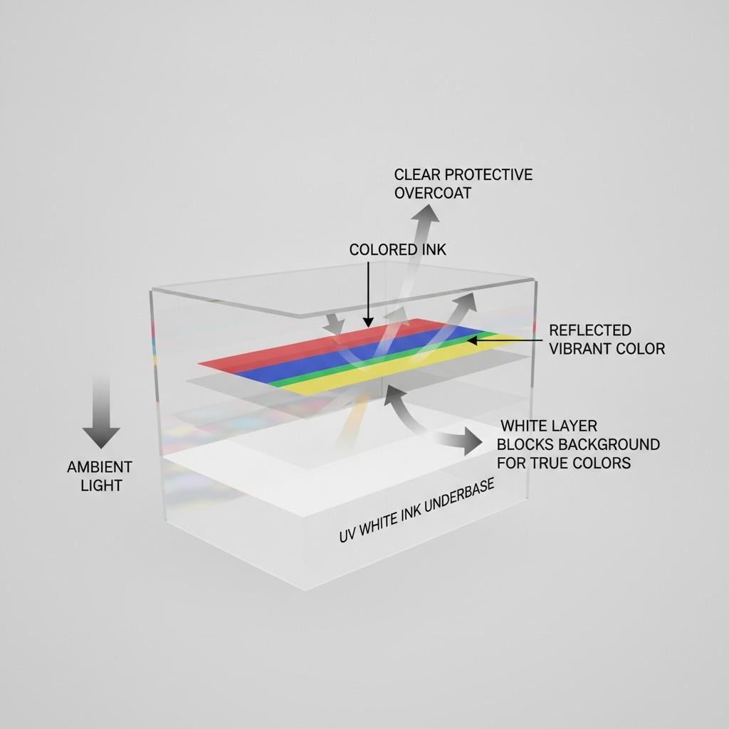
Acrylic does not behave like paper. Light passes through parts of it, reflects off the back, and bounces back through the ink. That is why printed acrylic colors, especially lighter tones, can shift quickly if there is no opaque white beneath them. White ink gives the printer a controlled base. It can block the background, support color density, or create selective highlights depending on how the file is built.
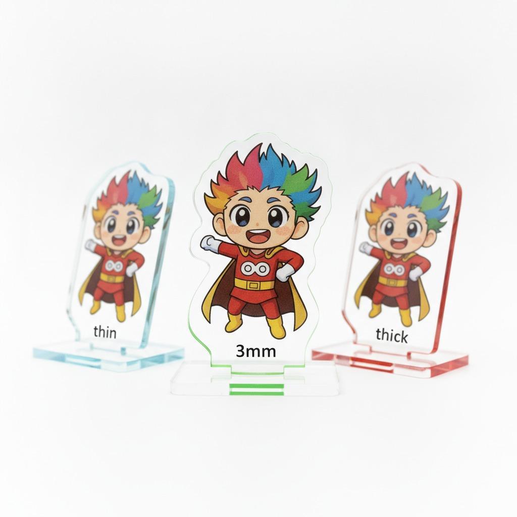
For decorative pieces such as a cartoon panda wall sign, the white border and bright filled areas are not just aesthetic details. They help the silhouette stand off the wall and keep the character readable from a distance. That is exactly where acrylic underbase printing earns its keep: the white layer separates the art from the substrate and makes the colors feel more deliberate.
Common ways white is used in acrylic printing
1. Full underbase
This is the most common approach when the design needs solid color fidelity. The printer lays down UV white ink beneath the color print so the artwork does not sink into the background. For dark graphics, small text, or cartoon art with bold tones, this is usually the safest option.
2. Spot white
Spot white is used only where the design needs support. It can preserve some transparency in other areas, which is useful for layered effects. On a decorative panel, spot white might be used behind the panda figures but not behind every background element.
3. White as a design element
Sometimes the white is not hidden at all. A white border, outline, or highlight can be part of the composition. That is common in signs and wall decor where the shape itself matters as much as the illustration. It also helps when the product will sit against a busy wall color.
A practical workflow for better results
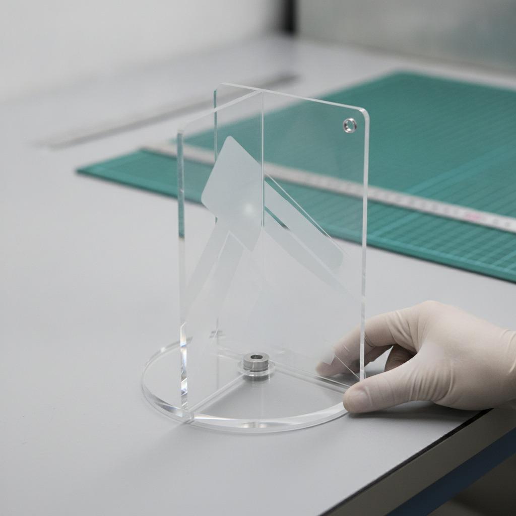
Start with the substrate and finish, not the artwork. Acrylic can be clear, frosted, painted, or backed with another layer, and each version changes how much white you need. Then decide whether the print is meant to look opaque, layered, or semi-transparent. That choice drives the underbase strategy.
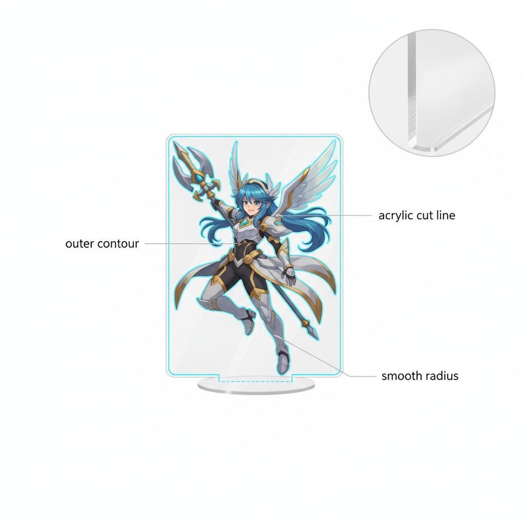
Next, check edge treatment. Die-cut sign pieces and sticker-like cutouts need the artwork, white border, and cut line to agree with one another. If they drift, the design can look off-center or sloppy, even if the print quality itself is fine. For a shaped panda sign with multiple small figures integrated into the layout, registration becomes a real production issue, not a cosmetic one.
Finally, ask for a sample or proof on the same material family if possible. A screen preview rarely tells you how the white ink will sit on acrylic, and that is especially true when the final product includes fine outlines, layered cartoon shapes, or soft gradients.
Selection criteria that actually matter
Buyers often focus on image resolution alone, but with acrylic printing the bigger issues are opacity, adhesion approach, and visual contrast. If the product is meant for nurseries, classrooms, or retail decor, the surface should also be evaluated for easy viewing and clean presentation under normal indoor lighting. In plain terms: does the sign still look crisp when mounted on an ordinary wall, not just in a catalog photo?
UV white ink is frequently used in this kind of work because it can print directly and create fast, vivid builds on suitable rigid surfaces. Still, not every job needs maximum opacity. Overbuilding white can make colors look heavy or reduce the sense of depth. That is one of those details that separates a decent sign from one that feels thoughtfully made.
Common mistakes buyers run into
The biggest mistake is assuming acrylic printing behaves the same way as vinyl or paper graphics. It does not. Another common issue is ignoring the background color where the piece will be installed. A panda sign that looks bright on a white bench can disappear on a patterned wall if the white border is too narrow.
Buyers also sometimes over-specify color without discussing the white layer. That is backwards. The underbase is often what decides whether the final print feels vibrant or dull. If the vendor cannot explain how they handle white ink printing on acrylic, keep asking until the process is clear.
Buyer advice before you place the order
Use the artwork to define the print strategy. Decide where you want total opacity, where a little translucency is acceptable, and whether the white border is part of the look or just a production aid. For cartoon decor, children’s room pieces, or brand mascots, the design usually benefits from a stronger underbase and a clean cut edge.
Also, confirm the intended use. Indoor decorative signs are a different conversation from exterior panels, and the article here should not pretend otherwise. If the item is only for visual decoration, keep the specification tight and avoid overbuying features you will never use.
Quick FAQ
Is white ink always necessary on acrylic?
No. It depends on the substrate color, the artwork, and the desired look. But for bright graphics or detailed cartoon art, white ink is often the difference between vivid and weak.
Does a white underbase make colors look flatter?
Sometimes it can if overused. A good production plan uses just enough white to support the art without making it look chalky.
What should I ask the supplier?
Ask how they build the white layer, how they align print to cut, and whether they can show a sample on similar material. That one conversation can save a surprising amount of rework.
A sensible next step
If you are evaluating a custom acrylic sign or decorative cutout, ask for a print plan before you approve the file. A simple discussion about UV white ink, underbase coverage, and edge registration will usually tell you more than a polished product photo ever will. That is the practical way to make sure the final piece looks like the artwork you approved, not just a close approximation of it.