
How to Design Acrylic Standees Without Breaking the Artwork or the Cut Line
If you are trying to learn how to design acrylic standees, the real challenge is not only making the art look good on screen. It is making sure the artwork survives the manufacturing step, the cut line reads cleanly, and the finished piece still feels collectible when it sits on a shelf or hangs in a display. A design that looks polished in a mockup can become awkward fast once it is contour-cut, printed on glossy acrylic, and reduced to a small retail object.
That matters because buyers in merchandising, gifting, events, and fan goods are usually deciding between products that all promise “custom.” The better choice is rarely the flashiest render. It is the one with disciplined composition, a sensible silhouette, and a print layout that respects the material. For sourcing managers and product teams, this is the difference between a design that produces cleanly and one that creates production headaches.
What an Acrylic Standee Needs to Do
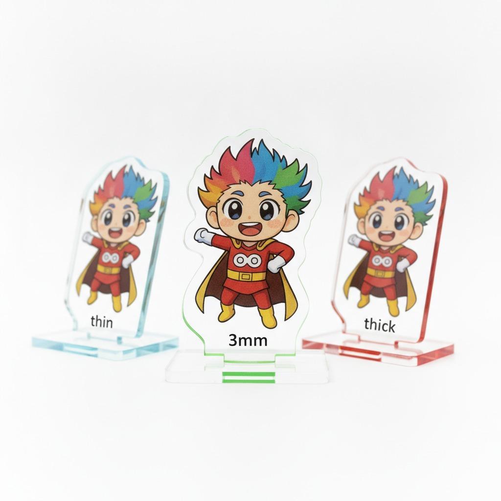
An acrylic standee is a visual object first and a functional object second. It has to read instantly from a short distance, hold color well on a transparent or semi-transparent substrate, and keep its profile sharp after cutting. The sample described here fits a decorative acrylic sign or ornament style: glossy surface, full-color artwork, a custom contour, and a round chibi-style scene composition with characters, lanterns, and a small boat-like element near the bottom.
That combination gives a useful clue for designers. When the shape is compact and highly themed, the silhouette becomes part of the story. You are not just placing art inside a rectangle. You are designing the edge, the negative space, and the balance between the frame and the inner illustration.
Start With Display Composition, Not Decoration
Good display composition is usually what separates a souvenir-looking piece from a product that feels intentional. In a small acrylic format, crowded art can collapse into visual noise. Leave enough breathing room around faces, lanterns, lettering, and any emblematic objects. A circular or scalloped border can help contain the scene, but it should not choke it.
For themed merchandise, the main characters should remain the anchor. Supporting elements such as lanterns, floral motifs, or a boat at the base should guide the eye rather than compete with it. If the scene is festive, use the background elements to frame the action. If it is character-led, keep the environment lighter and let the figures do the talking.
Scene Acrylic Standee Design: Keep the Story Readable
In scene acrylic standee design, layering matters even when the product is a single printed panel. You can still create depth by varying scale, using overlapping motifs, and controlling contrast between foreground and background. A useful rule is simple: the more detailed the artwork, the more disciplined the border needs to be.
For anime standee artwork or festival-themed collectibles, it helps to test the design at actual product size early in the process. A composition that looks elegant at A4 scale can become busy once it is shrunk down. Small eyes, thin decorative lines, and dense background patterns are often the first things to fail.
The Cut Line Is a Design Element, Not a Manufacturing Afterthought
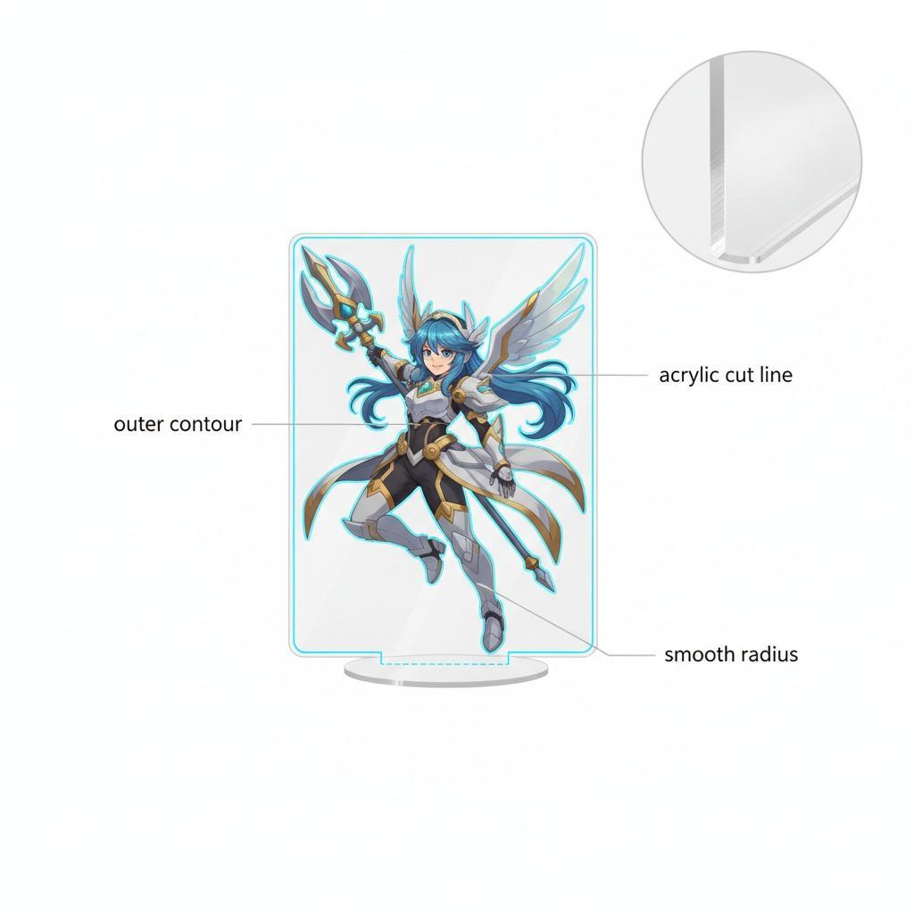
The acrylic cut line, even when it is invisible in the final rendering, should be treated as part of the artwork. A contour cut works best when the outline follows the natural shape of the scene and does not interrupt the most important visual details. Smooth curves, generous radii, and deliberate offsets from key artwork edges usually produce a cleaner result than overly intricate profiles.
From a manufacturing standpoint, a polished edge and a clear outer contour are part of the product’s perceived value. Laser cutting or CNC contour cutting is often used for this kind of item, with direct printing such as UV printing commonly associated with the vivid color and glossy finish. That is an informed inference, not a guarantee, so buyers should confirm the process with the supplier before locking the artwork.
Practical Design Checks Before You Send Files
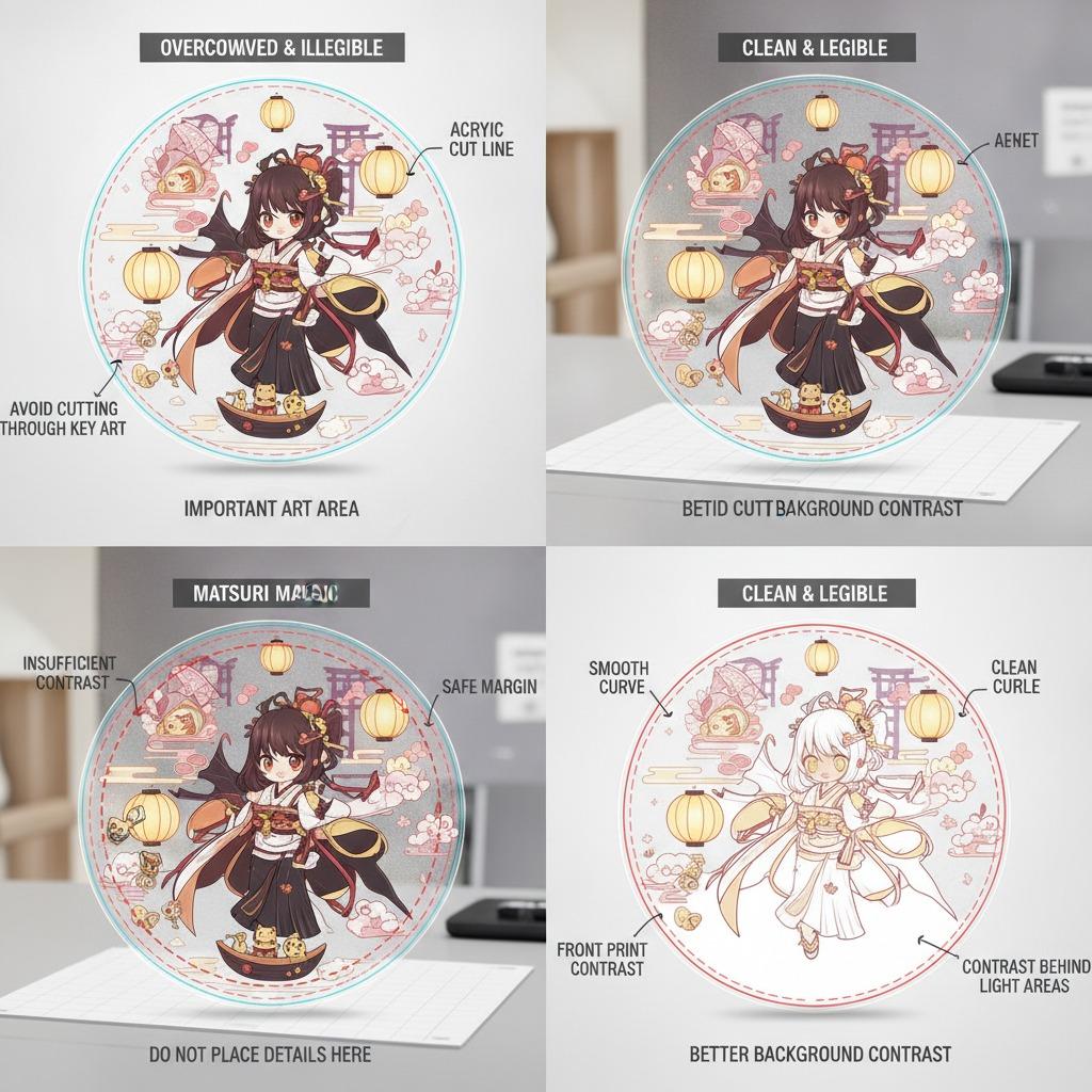
Before handoff, make sure the important details survive trimming. Keep faces, text, and fine ornaments away from the edge. Build in safe margins around the contour and remember that transparent acrylic changes the way whites and light colors appear. A pale lantern glow on screen may look flatter on the finished piece if there is not enough contrast behind it.
Also check the backside behavior of the print. Some acrylic goods are front-printed and read through the material differently than paper or PVC products. If the piece is meant for a desktop collectible or gift shop display, think about how it will be viewed under ambient light. Glossy surfaces can look premium, but they also show fingerprints and reflections. That is a small thing, until it isn’t.
Common Mistakes Buyers and Designers Make
One common mistake is overloading the composition with too many focal points. Another is assuming the print method will rescue weak artwork. It will not. A third is treating licensing and brand use casually, especially in anime-related merchandise. If the product is fan-merch or a commemorative piece, the legal side should be cleared before production, even when the design itself is solid.
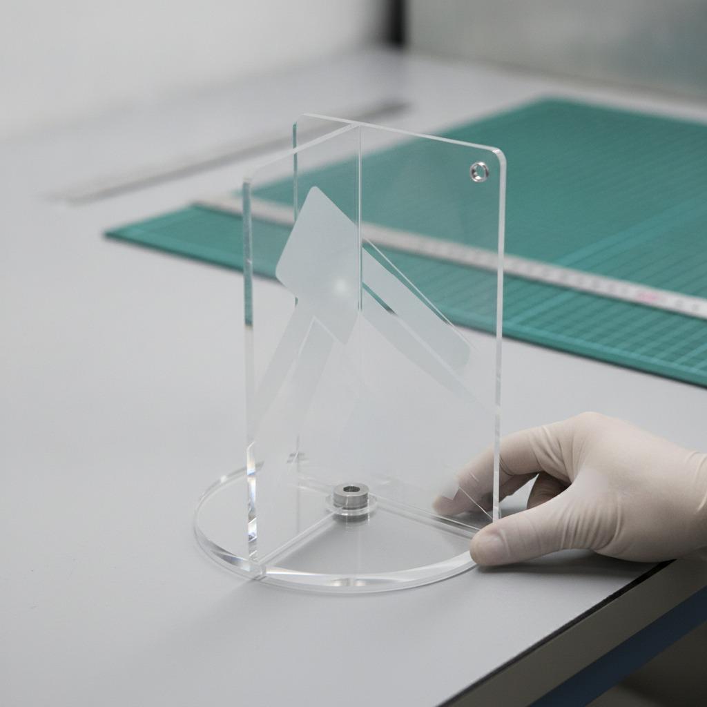
Another practical warning: do not assume all acrylic products include the same hardware. The described item appears to be a single-piece decorative panel, with no visible stand or hanging accessory. If the end use depends on a base, hook, or slot, that detail must be specified in the brief. Otherwise the finished product may be technically correct and commercially annoying.
What Good Buyers Ask Suppliers
Ask for proof of how the border is cut, how the print is aligned to the contour, and whether the final piece will be supplied as a standee, wall plaque, hanging display, or ornament. Ask what material is actually being used, since “acrylic-like” descriptions can hide different plastics. Ask for a preproduction sample if the artwork is detailed or the silhouette is unusual. That step saves more arguments than it costs.
For holiday and gift inventory, also ask about indoor and outdoor suitability only if the supplier can state it clearly. Do not infer UV resistance from appearance. A glossy finish does not tell you much about durability.
Quick Buyer Takeaways
Use the artwork to define the silhouette, not the other way around.
Keep the composition legible at actual product size.
Treat the cut edge as part of the visual design.
Confirm material, print method, and hardware instead of assuming them.
Verify licensing if the piece uses anime standee artwork or other protected character art.
Next Step
If you are preparing a new acrylic merch item, build the first draft around the final cut shape, then revise the illustration to fit that boundary. That approach usually produces cleaner samples and fewer production revisions. For teams sourcing seasonal decor, fan goods, or gift-shop inventory, it is the most reliable way to move from concept art to a sellable acrylic standee without surprises.