
Why custom glitter acrylic cards keep showing up in merch plans
For many product teams, custom glitter acrylic cards sit in an interesting middle ground: they are part display piece, part collectible, and part packaging experiment. They feel more substantial than a printed postcard, but they are not as complex as a molded figure or a full standee program. That is why they keep appearing in anime retail lines, fan gift assortments, and small-run promo projects.
The real question is not whether they look good on a shelf. They usually do, especially under store lighting. The question is whether the format fits the buyer’s use case: resale margin, gifting, display value, shipping risk, and the amount of artwork preparation the team can realistically handle. If you are sourcing an anime acrylic character card, or planning an OEM acrylic cards program, this is the decision that matters.
What the format actually is
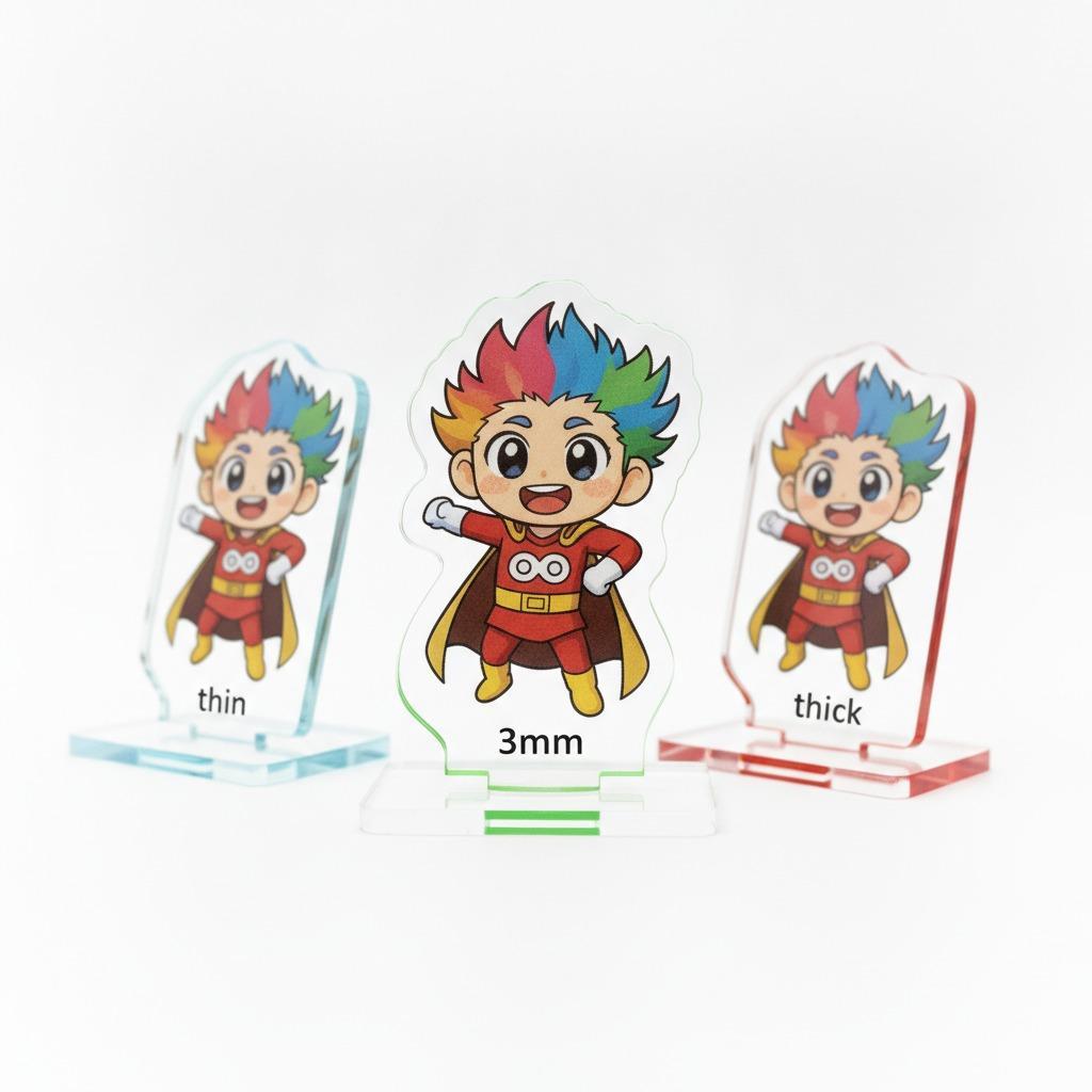
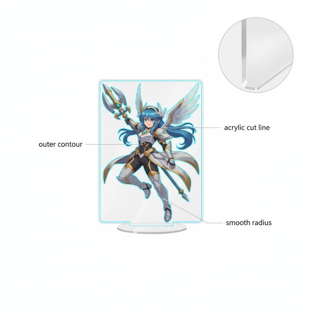
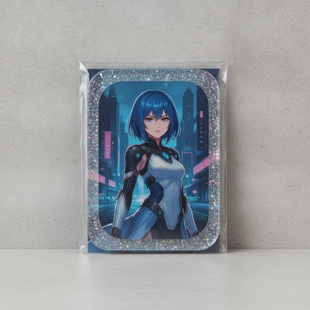
From a manufacturing and merchandising point of view, these products usually combine a rigid decorative front, printed artwork, and retail-ready packaging. The visible item in the provided material shows a rounded-rectangle shape, a glossy transparent surface, a single character illustration, and a printed backing card that frames the piece like a miniature display product. The exact base material is not confirmed here, so it is safer to treat the item as an acrylic/plastic-style collectible rather than assume a specific substrate.
That caution matters. Buyers often ask for “acrylic” when they really need a particular feel, clarity, scratch resistance, or print appearance. In practice, the final result depends on the material stack, the print method, edge finishing, and packaging. Two products can look similar in a product photo and behave very differently in transit.
Where this product category works best
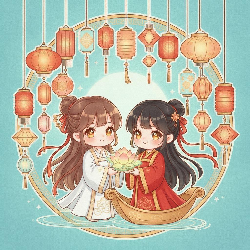
Custom collectible cards like these are strongest when the artwork itself is the hero. A single illustrated character portrait, a clean border, a signature-style name line, and a strong color palette can carry the item without much structural complexity. That makes the format useful for fandom merchandise, seasonal gifts, event exclusives, and shelf-friendly point-of-sale displays.
They also work well when you need something that feels more premium than paper but less expensive to develop than a fully engineered display product. For small-batch retail, that in-between position can be useful. It gives sourcing teams a way to test fan response before committing to a larger product family.
What to check before ordering
Artwork and print layout
The biggest mistake buyers make is treating the item like a standard card. It is not. The image area, border, name placement, and any signature-like text need to be designed for the physical shape, not just dropped in from a poster file. Rounded corners can affect framing. Gloss can hide light details. Dark artwork can look rich on screen and flat in real light.
Material and surface behavior
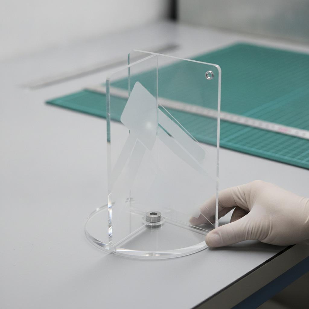
If the product is intended as a decorative desk piece or collectible display, ask how the surface is finished and how the print is protected. Gloss can add visual depth, but it also shows fingerprints and light scratches more readily. For buyer-facing retail, that can become a presentation issue if packaging is loose or if the product rubs against the backing card during shipment.
Packaging and shelf presentation
The supplied image suggests a single-piece packaged format with a printed backing card. That is a practical setup because it supports hanging or shelf display and gives the product a finished retail look. Still, packaging should be treated as part of the product, not an afterthought. A nicely printed card can lift the perceived value more than many teams expect.
Quick buyer comparison: when to choose this format
Choose a glitter-style or glossy acrylic card when the main goal is visual appeal, collectible impulse purchase, and compact shelf footprint. Choose a simpler printed card when cost sensitivity is high and the product will be handled frequently. Choose a more rigid display plaque when the item needs to stand out as a gift or premium bundle component.
The trade-off is straightforward: more visual finish usually means more process steps, more surface sensitivity, and more QA attention. That is not a reason to avoid the format. It is just the cost of making something that looks good under retail lights.
Common sourcing mistakes
One frequent problem is unclear ownership of the artwork or character IP. Another is over-specifying the product without confirming the real structure first. Buyers sometimes write a request as though the item were a standard card, then later expect acrylic-like clarity, glossy depth, and rigid display behavior. Those expectations need to be aligned early.
A second mistake is ignoring packaging friction. If the item is meant for resale, shipping abrasion and display damage can erode the visual appeal fast. A protective backing card helps, but it does not solve poor fit or weak retention inside the pack.
Practical advice for product teams
If you are evaluating custom glitter acrylic cards for an anime merchandise line, start with the end use. Is this a desk decoration, a giftable collectible, or a low-cost fan item for retail checkout? The answer changes the required finish, packaging, and artwork density. For example, a busy illustration may look great in a hero image but crowded in a small rounded format.
Also, ask for a sample view that reflects the real retail condition, not just a clean isolated render. The interaction between glossy front, printed backing, and packaging card is part of the product story. In this category, presentation is not decoration; it is function.
What a good RFQ should include
When you contact an acrylic photo card manufacturer, it helps to provide the intended use, artwork dimensions, packaging expectations, and whether the product is for resale, gifting, or promotional distribution. If you are comparing custom collectible cards across suppliers, keep the brief consistent so you are not comparing one supplier’s premium build against another supplier’s bare-bones version.
If the product is for fandom or anime merchandising, say so clearly. The visual language is different from corporate promotional goods, and the production choices should reflect that difference.
Next step
If you are planning a small-run merch test or a retail collectible line, build the brief around the actual shelf experience: artwork clarity, gloss level, packaging protection, and the way the piece will look when someone picks it up under store light. That is where custom glitter acrylic cards either earn their place or get quietly replaced by something simpler.
Send a product brief, confirm the visible structure, and request a sample conversation before locking the full run. In this category, that extra round of checking usually pays for itself.